TypeLyft - Responsive Type Scale and Typography Scale Builder
A free open-source typography scale builder that helps designers and developers plan responsive type systems, preview real layouts, and export CSS, Tailwind 4, or SASS tokens without accounts or a database.
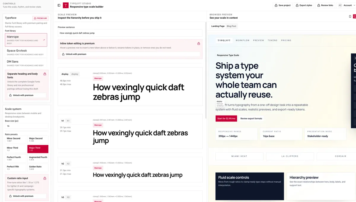
TypeLyft is a free open-source responsive type scale builder I built under Pagelyft Studio. It helps designers, front-end developers, and teams plan a typography scale, test hierarchy in realistic layouts, and export implementation-ready CSS, Tailwind 4, or SASS tokens without signing in or creating a project record.
Why I Built This
Typography work often starts with a spreadsheet, a ratio, and a few hand-built clamp values. That can work for one page, but it becomes hard to repeat across landing pages, blog templates, and product screens.
TypeLyft turns that workflow into one focused browser-based tool. You choose a base size, ratio, and viewport range, then preview the scale in real page contexts before exporting code your team can paste into a project. There is no account system, paid tier, database, or project dashboard to maintain.
Overview
TypeLyft focuses on one job: making responsive typography systems easier to define, review, and ship.
- Responsive scale builder: Tune base size, modular ratio, and min and max viewport values
- Fluid clamp output: Generate clamp values for display, headings, body text, and captions
- Layout previews: Check the type scale against landing page and blog layouts at mobile and desktop sizes
- Export options: Copy or download CSS custom properties, Tailwind 4 theme tokens, or SASS variables
- Rhythm spacing: Include spacing tokens that follow the scale
- No account required: Open the builder, adjust a scale, and export without a login flow
- No database dependency: Keep the workflow local to the builder instead of storing user projects on a server
- Free and open source: Use the tool without a paid tier
Technical Breakdown
Tech stack: Next.js, React, TypeScript, Tailwind CSS v4, Zod.
- Built the product interface with Next.js, React, and TypeScript
- Used Tailwind CSS v4 for the design system and export language
- Validated builder settings and export state with Zod
- Designed realistic landing page and long-form previews so scale decisions can be checked in context
- Created export formats for CSS custom properties, Tailwind 4 tokens, and SASS
- Removed the earlier auth, billing, and database architecture so the app stays lightweight and open
- Published the app at https://type.pagelyft.studio/
Key Features
- Live type scale editing: Adjust ratio, base size, viewport range, and roles while the preview updates
- Real layout previews: Review hierarchy in landing and blog layouts before committing tokens
- Mobile and desktop checks: Switch viewport contexts to catch weak type decisions early
- Production-ready exports: Copy CSS, Tailwind 4, or SASS output when the scale is ready
- Google Fonts workflow: Pair fonts and include optional import output
- Handoff-friendly tokens: Share named values developers can use without translating design notes
- Open-source access: Use the builder freely without subscription gates
Technical Highlights
Responsive Scale Math
The builder turns a base size, modular ratio, and viewport range into clamp expressions for each typography role. The same settings drive the preview and the exported code, so the final tokens match what users reviewed in the interface.
Contextual Preview System
Type scales are hard to judge in a list of numbers. TypeLyft renders the scale inside landing page and blog preview surfaces so users can compare display text, headings, body copy, captions, and spacing before they export.
Multi-Format Export
The export panel packages the same scale into CSS custom properties, Tailwind 4 theme tokens, and SASS variables. This keeps the decision portable across static sites, marketing builds, and front-end systems.
Lightweight Open-Source Architecture
TypeLyft started with more SaaS-style assumptions than it needed. I removed login, billing, Drizzle ORM, and database persistence so the tool could focus on the builder itself. That made the product easier to maintain and easier for users to trust because the core workflow does not depend on storing accounts or project data.
Obstacles and Solutions
Obstacle: Making Type Scale Math Feel Practical
A mathematically clean scale can still feel wrong when it reaches real copy. Early versions made the numbers clear, but the hierarchy still required too much imagination.
Solution
I added real page previews next to the scale controls. Users can now adjust values and immediately see how the decisions affect a landing page and a long-form article layout.
Obstacle: Keeping Export Output Consistent
Supporting CSS, Tailwind 4, and SASS creates room for small mismatches between formats.
Solution
I made the export formats derive from the same validated scale model. Each formatter receives the same normalized settings, which keeps the generated output aligned.
Obstacle: Cutting SaaS Features That Did Not Serve the Tool
The first version carried extra product surface: account logic, billing assumptions, and a database-backed project model. Those pieces made sense for a paid app, but they were too much for a free typography utility.
Solution
I simplified the architecture around the builder. TypeLyft now works as a focused open-source tool with no login, no subscription gate, and no database requirement. The result is easier to use, easier to ship, and more aligned with the way people need quick typography decisions.
Author
Aaron Molina - Senior Frontend Developer
Credits
Project Details
Quick facts- Completion Date
- May 2026
- Project URL
- https://type.pagelyft.studio/
- Technologies
- Next.js React.js TypeScript Tailwind CSS zod Fullstack